
I have always enjoyed reading and recently (over the past 2/3 years) I have started to write, which has become a hobby of mine, writing mostly fiction and some critical/opinion pieces. So from these passions in my spare time and indeed in many other scenarios I have been immersed in type either directly or indirectly as are most of us day to day. On top of this throughout my Masters I have enjoyed working with type more and more, using it as an image or in visual puns and so on. In fact it was only when I was struggling for a concept/brief for my project, after deciding against the previous idea of a mens magazine, that I thought about type design. Therefore it only seems logical to further continue down this path and to explore typography in greater detail and get to the very core of the subject. Additonally I am a big fan of art deco design and type having been exposed to it at a young age through a variety of Saturday morning cartoons, most notably Batman: The Animated Series of the 1990s. This style or 'dark deco' as it was labelled combined a variety of genres such as Film Noir, 1940s vintage aesthetics, detective stories and the amalgamation of gothic and art deco styles or 'dark deco' as previously mentioned. Even writing about it now makes me realise the influence it had on me as I adore film noir, crime/detective stories, 1950s posters/design, retro-futurism (brought about via the combination of the 1940/50s design of the cartoon and the modern/futuristic technology featured within it) and of course art deco.
Having mentioned all this I think you should view the intro for yourself and enjoy the beautiful animation. Watching it myself made me realise I could possibly also credit my use of silhouettes to this program.
http://en.wikipedia.org/wiki/Batman:_The_Animated_Series
After having wandered slightly off topic, back to the main project.
For my Major Project I am aiming to create three abstract tyepfaces which will be glyphic/pictogrammatic in nature and will test the boundaries of legibility. I will take influence from art deco design and employ geometric lines and shapes to help form my typefaces.
I propose to research many typographers, traditional and contemporary to give me a greater understanding of the medium and to learn and be inspired from their designs and ideas. I will also delve further into the history of typography and its pictograph begins through to its current iteration. Looking into typography's origins as pictograms, which developed into characters and eventually the letters we use today will put me in greater stead when designing my own typeface and give greater weight to my designs.
Examples of the Art Deco styling/type in the Batman cartoon as mentioned previously:


The typeface used on the main titled card and in the third image is Plaza.
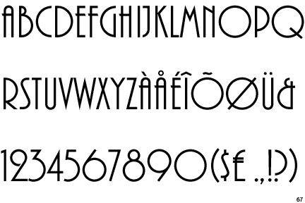
Despite looking very art deco, this was actually designed in 1975 by Alan Meeks.